I like the lightning bolt. I also like the intenseness of the photo. I also like how dramatic the photo is.
One thing that could be better is the quality of the image. I find that he focused too much on the mood the photo would display. This caused him to forget about the quality of the photo.
One piece of advice I would give would be to try to find a balance in your editing. For example the photo needs a balance between mood, color and quality. Besides that it’s a very good photo.
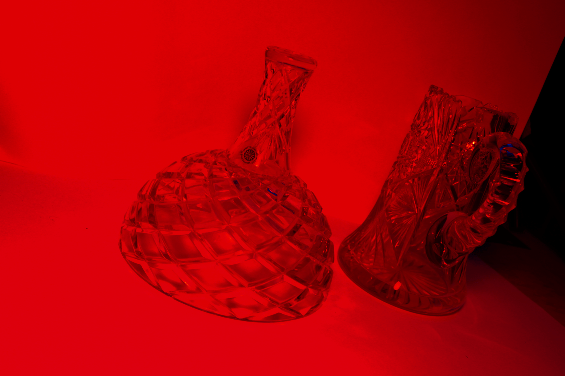
I like the angle taken by the camera of the glass in this photo. The angle of the glass gives the image sort of a vintage feel. I also like the red color chosen in the photo. One thing that could be better about this photo is the diversity of the color in the photo. This image would be a lot better if it included more color and it was more interesting. Color in the photo is so important because the shadow can poke out more if you include more colors. Advice I would give to Liam is to work harder on the photos and try to make them more interesting. The photo isn’t neat, as the left end of the photo is not a white background compared to the rest of the photo. The photo doesn’t have color enough color in it either.
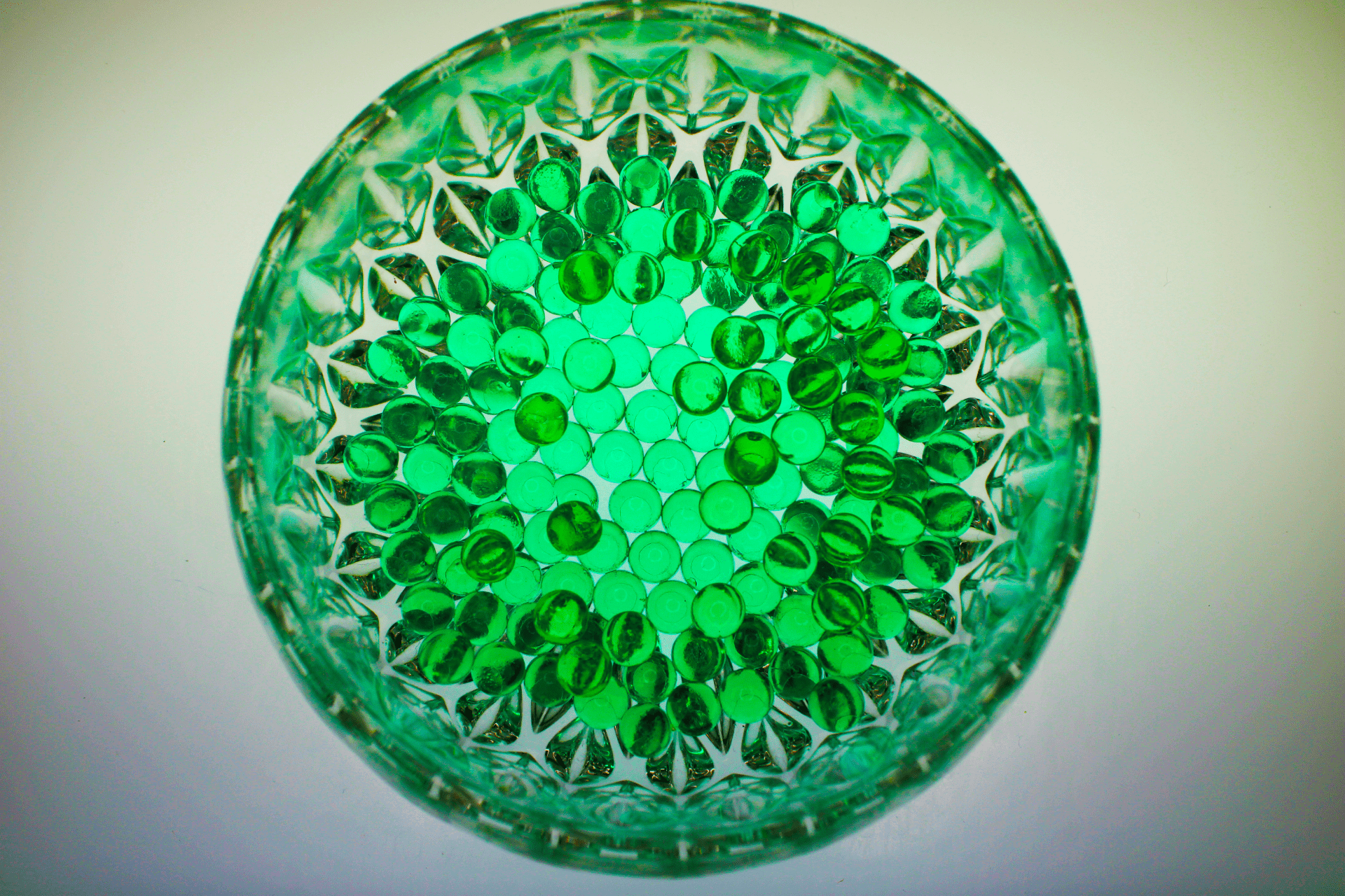
I like the color reflecting off the glass. I like how he used to make glass figures . I also like how he incorporated the glass into the picture.
I think he could have created a better photo with the panels because there really isn’t a shadow showing in the picture. I think he could’ve shown more shadows in the photoshop process. I would say that that is the only bad thing to the photo.
I would say to make sure they have the right angles. Make sure they have shadows. Also to make sure the camera is completely still to get no blur in the photo.
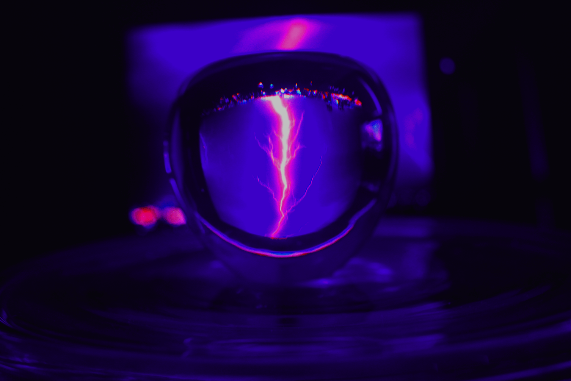
I like the lightning bolt. I also like the intenseness of the photo. I also like how dramatic the photo is.
One thing that could be better is the quality of the image. I find that he focused too much on the mood the photo would display. This caused him to forget about the quality of the photo.
One piece of advice I would give would be to try to find a balance in your editing. For example the photo needs a balance between mood, color and quality. Besides that it’s a very good photo.
I like the angle taken by the camera of the glass in this photo. The angle of the glass gives the image sort of a vintage feel. I also like the red color chosen in the photo. One thing that could be better about this photo is the diversity of the color in the photo. This image would be a lot better if it included more color and it was more interesting. Color in the photo is so important because the shadow can poke out more if you include more colors. Advice I would give to Liam is to work harder on the photos and try to make them more interesting. The photo isn’t neat, as the left end of the photo is not a white background compared to the rest of the photo. The photo doesn’t have color enough color in it either.
I like the color reflecting off the glass. I like how he used to make glass figures . I also like how he incorporated the glass into the picture.
I think he could have created a better photo with the panels because there really isn’t a shadow showing in the picture. I think he could’ve shown more shadows in the photoshop process. I would say that that is the only bad thing to the photo.
I would say to make sure they have the right angles. Make sure they have shadows. Also to make sure the camera is completely still to get no blur in the photo.